Do Dance Students Need Their Own Websites?
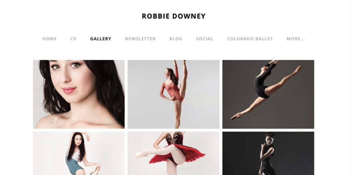
Colorado Ballet Studio Company dancer Robbie Downey has had her website, robbiedowney.com, for 10 years—nearly half her life. It’s changed through the years, but in that time, she’s relied on it to help secure auditions, network within the dance community, and find her own voice as a young performer at the start of her professional journey.
It’s easy to see why having a website is a good idea for any dancer hoping to go pro. At the most basic, “it’s a marketing tool,” says Andrea Jasper, founder of the creative design and management company Urbane Collective, who has created sites for dancers including Kaelynn “Kay Kay” Harris and Will “WilldaBeast” Adams. Jasper likens a website to a business card—it’s a way for casting directors, dance companies, and agents to get an idea of who you are and what you’re capable of.
But even if you’re not ready to go pro, a website is still a good idea. It’s a great way to compile and prepare information that will eventually be a part of college applications, for one. It’s also a way to steadily build and fine-tune your portfolio and learn how to market yourself for any career—even one outside of the dance world. Whatever your goals, building your own website can be a valuable experience.
First Things First
Before you dive into building your site, take the time to consider your branding—how you want others to view and think about your work. Consider both your short- and long-term goals. When Jasper helped WilldaBeast Adams create an early version of his ImmaBEAST site, they discussed his plans for the future, so they could incorporate them into his site’s framework later on. “Will saw ImmaBEAST as a whole enterprise,” says Jasper, noting that she left space in the site’s design for eventual merchandise sales and an “Events” tab to list convention dates. Jasper suggests making a list of your goals and then organizing your website’s format, content, and creative design accordingly. “Think about color concepts, too,” she says. “How do you want to be represented?”
 courtesy Klassen
While it can certainly be helpful to look at other websites or blogs that speak to you for inspiration, rising comp-circuit star Bella Klassen (bellaklassen.com) thinks a website should express your personality. Whether it’s an agent looking at your site or a fellow dancer who wants to get to know you, Klassen says, “Don’t try to pretend you’re someone else—embrace yourself!”
Don’t Forget the Basics
Your website should have a home page and a spot for your bio and/or full resumé. A media page for photos and videos is important, too. But don’t get carried away, says Jasper: Visitors can get too overwhelmed by a barrage of images and videos, especially if they span multiple pages. Not sure which pics or clips to choose? Downey suggests photos taken by someone with a dance background. “It makes a world of difference,” she says. And Klassen advises including both solo and group
videos. “If someone in casting is looking at your videos, they likely want to see how you work with other people, too.”
 courtesy Harris
It can be useful to include a contact page, but be sure to talk to your parents about this step especially. When Downey and her mom created robbiedowney.com, they used Weebly, a free website-building platform that offers a generic contact form, so they didn’t have to include personal info. If you’re a self-managed dancer, Jasper recommends only including your email address on your contact page—and never, ever, include your street address.
Be #Extra
Linking to or embedding your Instagram or YouTube accounts within your website demonstrates your social media savvy. Plus, says Jasper, it lets website visitors see what’s happening for you in the moment—classes you’re taking, work you’re creating, or any new work you’ve booked.
 courtesy Downey
Downey thinks a next-level website includes sponsorship information (or a link to PayPal or your Patreon account, if you have one), plus a notice if your website is parent-monitored. Don’t forget about your domain, either: “If you can get your first and last name, for example, that’s really good,” says Downey. She recommends opting for the dot-com extension, too, if you can get it—instead of dot-net. “It’s just easier and more common,” she says.
Above all, attention to detail is key. Proofread text and make sure any hyperlinks work. “You can tell when someone has put time into their website—they’re invested in it,” says Jasper. Similarly, your website’s professionalism can be a reflection of your work ethic in the studio. After all the time you spend honing your technique, make sure your online presence matches.
Website DIY
You don’t need to enlist a professional coder to get a solid site. Here are the top website builders that are intuitive, user-friendly, and inexpensive:
• Bandzoogle
• Squarespace
• Weebly
• Wix
• WordPress
A version of this story appeared in the February 2019 issue of Dance Spirit with the title “So You Think You Need a Website.”


